
Feelings
An emotional abstract collection
Feelings is a collection born from my inner journey. Each piece captures an emotion I lived through, where healing became creation and art became my path forward.
For an explanation of the ideas behind this collection, watch this video .
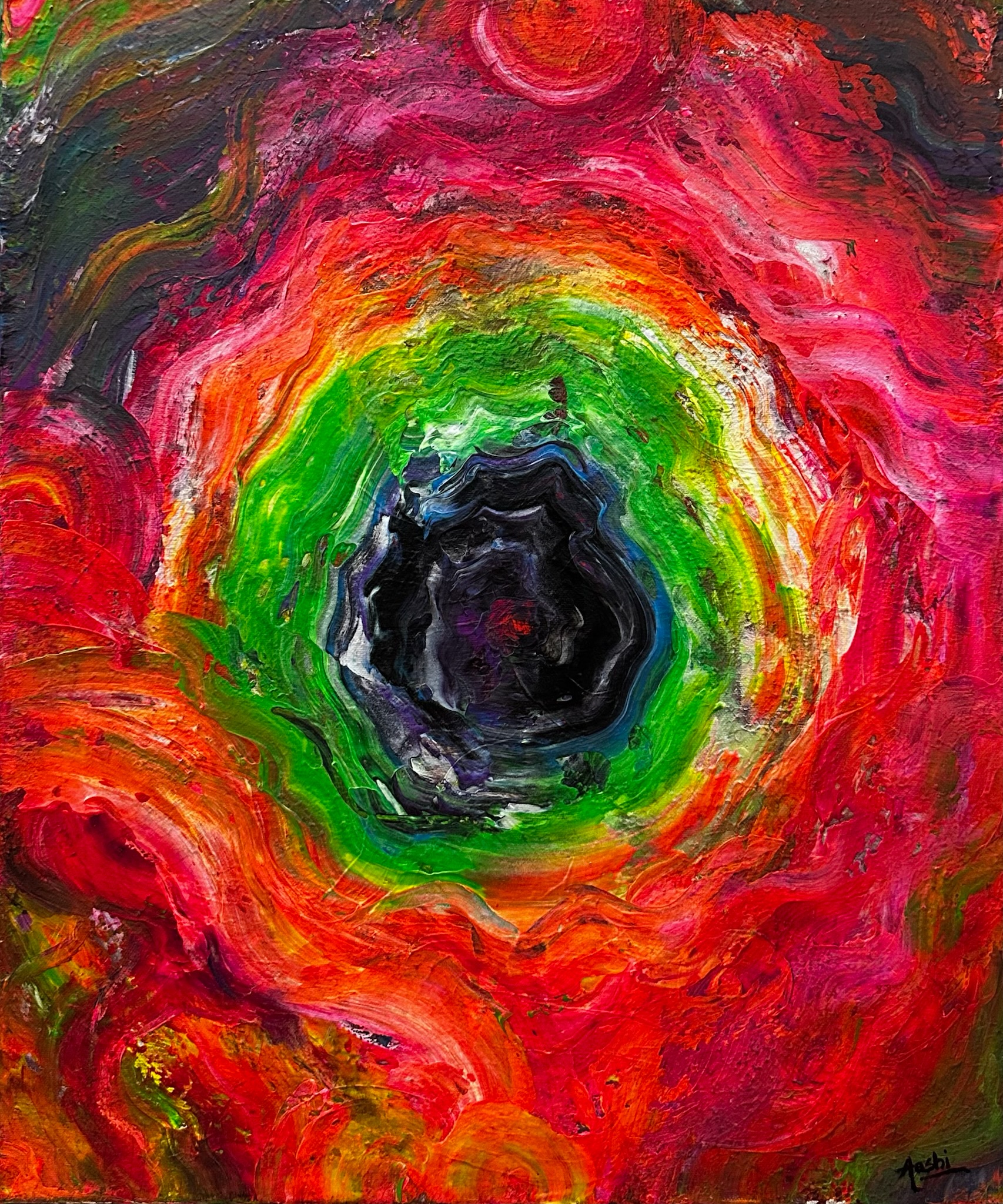
Focus
Materials Acrylic on canvas
Size 20 × 24 in · 50.8 × 61 cm
Rarity Unique
Medium Painting
Signature Hand-signed by artist
Frame Stretched canvas (wooden frame)
Certificate Included
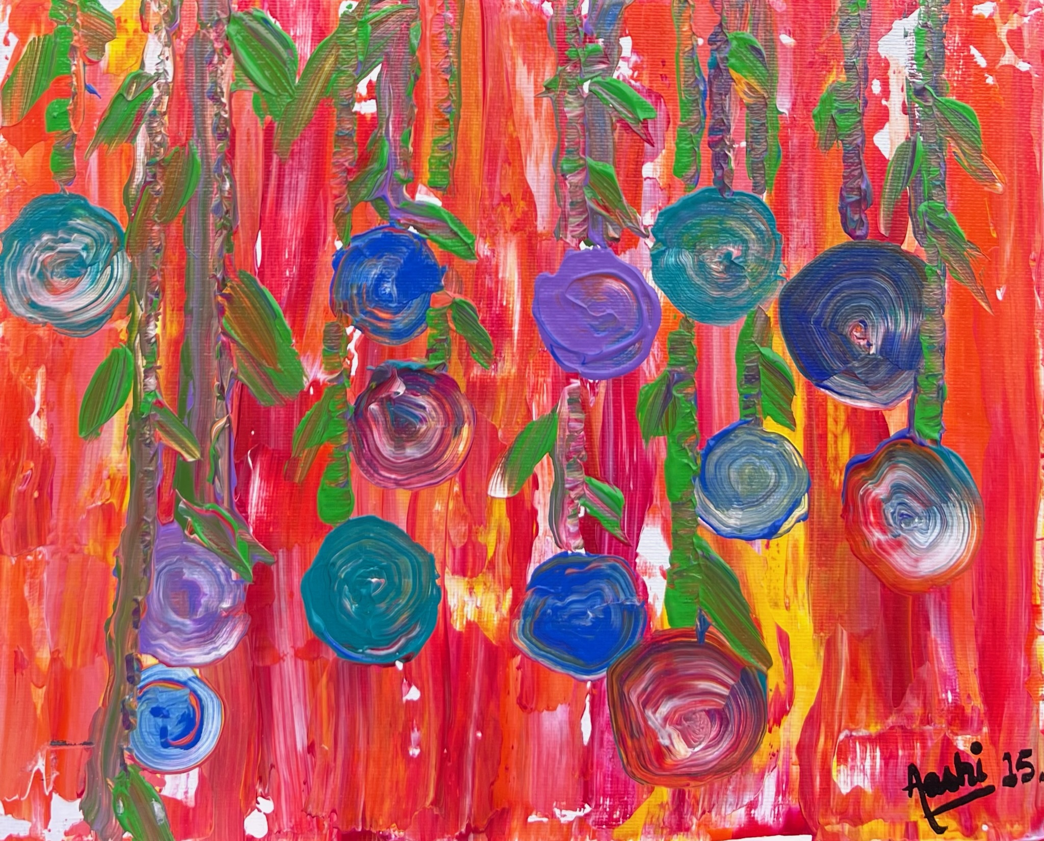
Hanging Dreams
Materials Acrylic on canvas
Size 8 × 10 in · 20.3 × 25.4 cm
Rarity Unique
Medium Painting
Signature Hand-signed by artist
Frame Stretched canvas (wooden frame)
Certificate Included
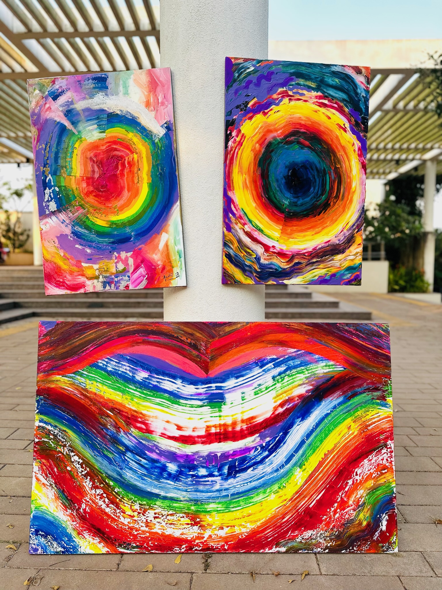
TRIP
Materials Acrylic on canvas
Size 20 × 30 in · 50.8 × 76.2 cm
Rarity Unique (multi-panel work)
Medium Painting
Signature Hand-signed by artist
Frame Stretched canvas (wooden frame)
Certificate Included

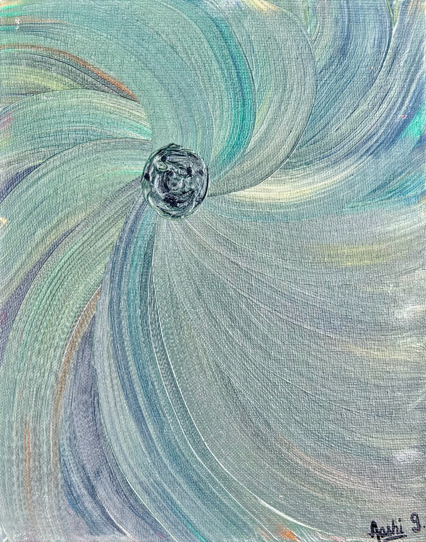
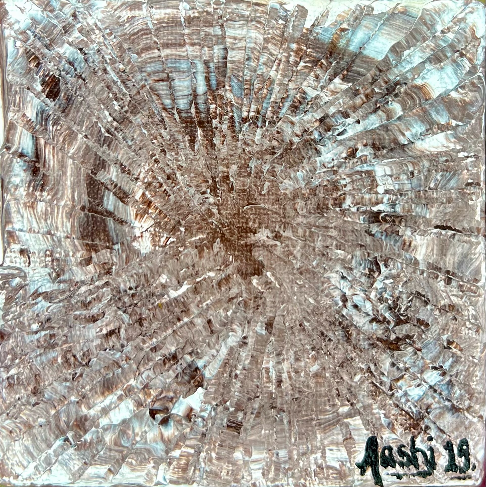
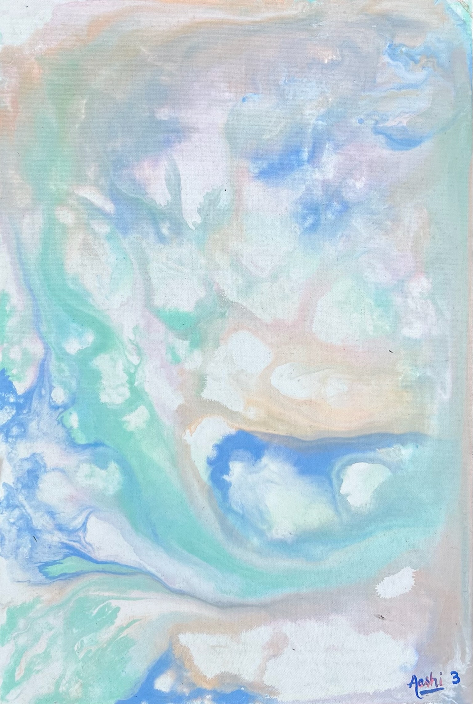
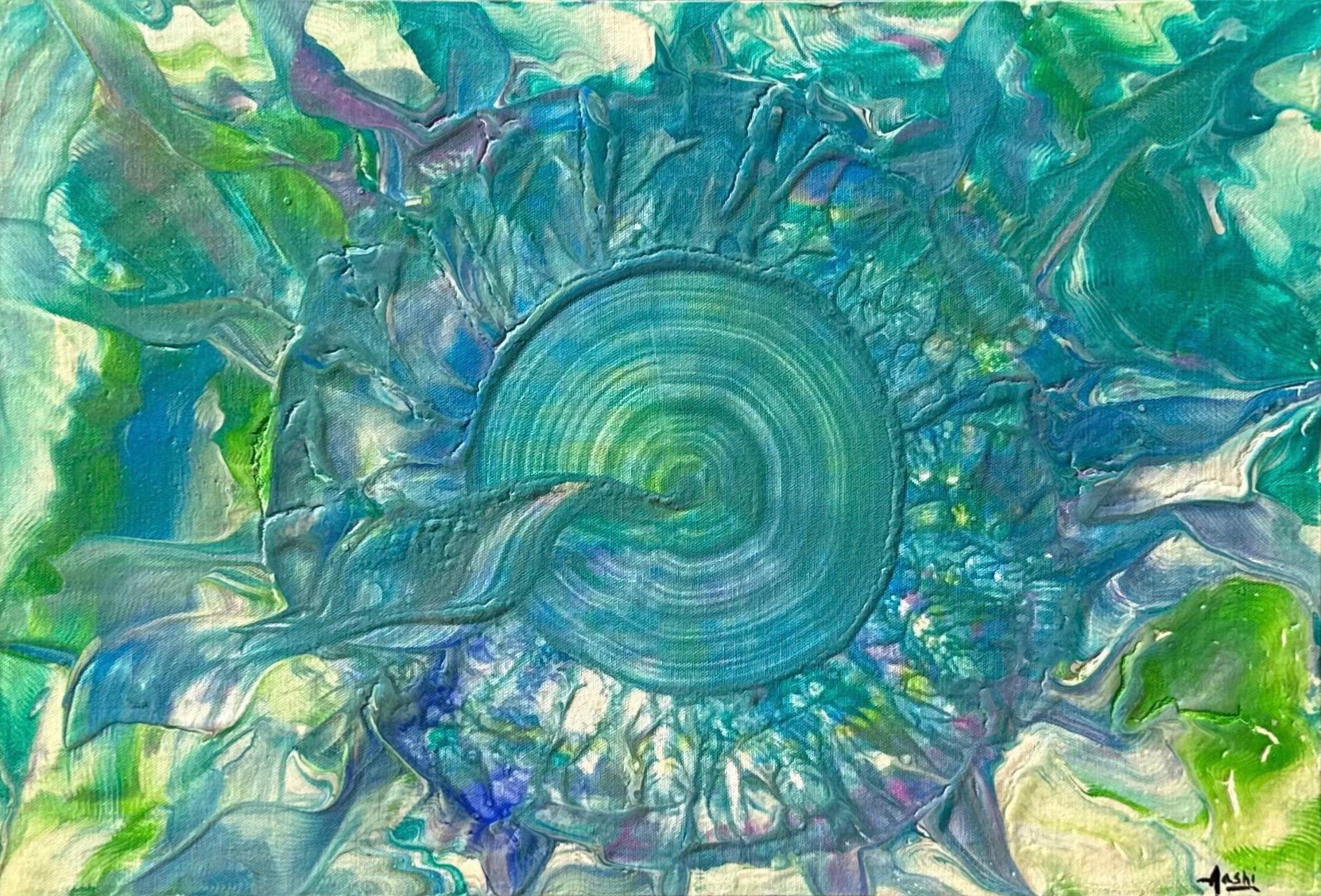
TRIP
Origin
TRIP was born during a period of personal turbulence.
The artist was navigating an emotionally difficult phase during her postgraduate years. Unable to express what she was carrying internally, she was advised by her therapist to find a safe outlet: to release emotion through art or a personal practice. Art became her lifeboat.
What began as private emotional release soon revealed an unexpected public resonance.
One evening, the artist was called out of her room into a hall filled with people dancing under RGB lights. A single painting “AASHI 17” (now the right eye of TRIP) had been placed at the centre. As the music played, people moved instinctively around it, responding to its energy. Someone remarked, “What a trippy painting.”
That moment marked a shift.
The artist realised that art did not have to remain a solitary act. It could hold space for others as well.
Colour, Identity, and Continuation
AASHI 17 was composed using seven colours, unintentionally aligning with the VIBGYOR spectrum. Coincidentally, the artist had a close LGBTQ+ friend, and the palette mirrored the pride flag.
Recognising this resonance, she chose to continue working with seven colours as a quiet gesture of solidarity, supporting not only her own journey, but the journeys of others navigating identity, emotion, and self expression.
The Work
The three paintings, two deeply spiralling eyes and a smiling mouth, together form one single artwork, titled TRIP.
TRIP represents the journey every individual must undertake alone. No one can walk it on another’s behalf.
TRIP began as an imagined character within the artist’s emotional universe. It holds pain, anger, shame, confusion, and vulnerability: everything that must be felt in order to be released.
Resolution
At the end of every journey, at the end of every trip, there is clarity.
There is victory, peace, and light.
When one looks back from that light, the darkness no longer appears as darkness. It reveals itself as a spectrum: seven colours, layered with meaning.
TRIP smiles.
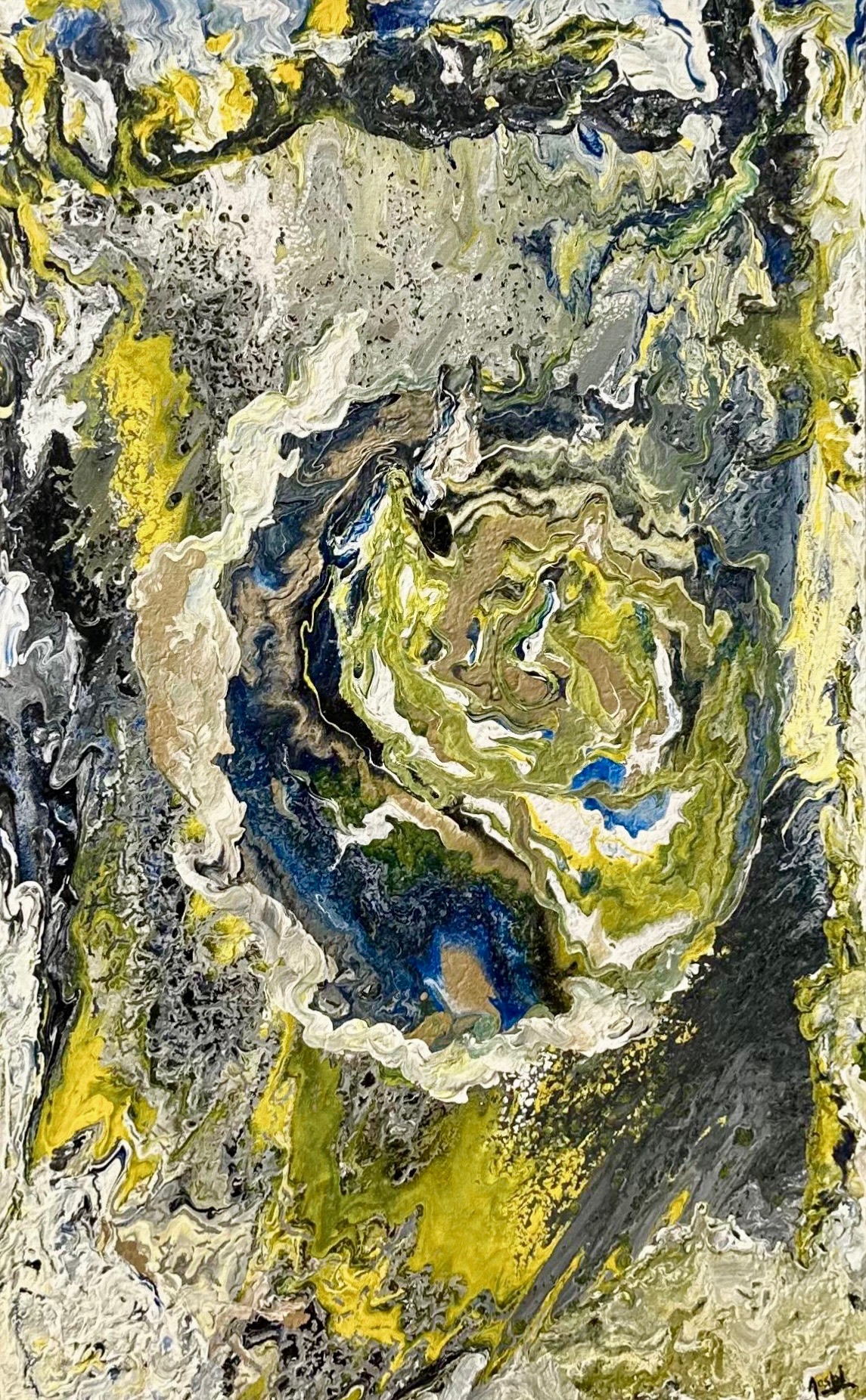
Distraction
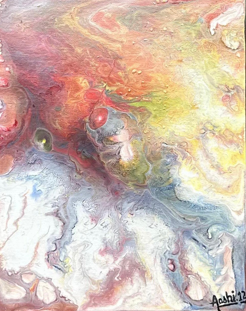
Distraction emerged from a phase in the artist’s life marked by an urge to avoid confronting reality and its underlying challenges.
Rather than resistance, the work explores intentional diversion: an attempt to momentarily step away from emotional weight.
The piece is created using the acrylic pour technique on canvas. To generate uninterrupted visual complexity, the artist deliberately varied the consistency of each colour, allowing every pigment to flow independently.
The chromatic progression within the work is deliberate: moving from black through blue and green, then into yellow, finally resolving into golden and white tones.
This transition mirrors a psychological shift, from emotional density toward clarity and possibility.
The work invites the viewer not to analyze, but to wander visually and momentarily let go.
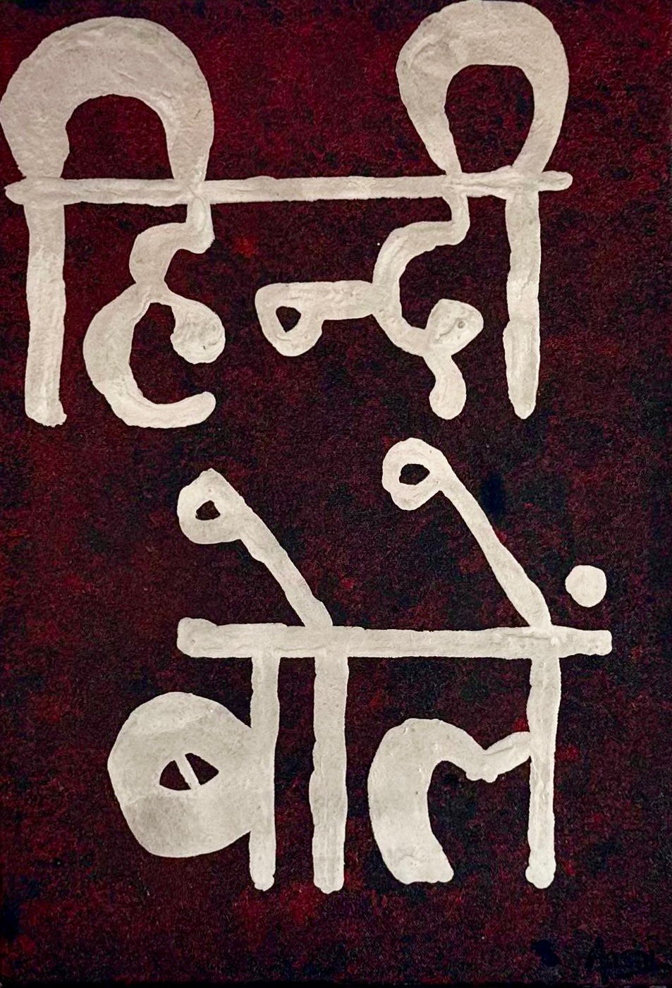
Hindi Bolein
Hindi Bolein is a quiet yet powerful statement about communication and belonging.
Created in Mangalore, a city of many languages, this work reflects the artist’s lived reality as a Hindi speaker navigating a multilingual space. The simple phrase “Hindi bolein” (“please speak in Hindi”) was placed prominently on the front wall of the artist’s residence not as resistance, but as an invitation.
Art as Communication
The artwork demonstrates how art can gently bridge differences. Without confrontation or explanation, it created understanding.
Visitors naturally began speaking in Hindi, finding common ground through a shared visual language rather than through instruction.
Meaning
Hindi Bolein stands as proof that art can solve everyday problems helping people coexist, connect, and thrive through empathy, respect, and shared understanding.
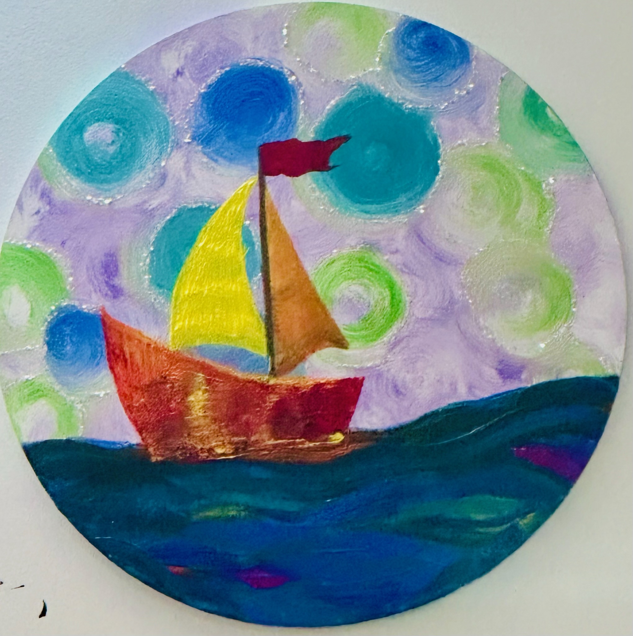
Lifeboat
A small boat moves across deep water under a sky full of movement.
Lifeboat represents that one thing, person, art, belief, or hope, that keeps someone afloat during emotional storms. It is about survival, faith, and trusting something small to carry you through something vast.
Vortex
Everything here moves toward a single centre. The flow feels inevitable, like being pulled into thought, memory, or decision.
Vortex represents moments when life draws you inward, forcing reflection, change, or surrender before release.
Bark
Thick textures radiate outward, strong and raw. This work feels protective, like skin hardened by time.
Bark speaks of resilience: how layers form over wounds, creating strength, not weakness. It is about endurance and growth through pressure.
Heaven
Soft pastels and gentle movement give this work a weightless feel.
Heaven reflects calm, peace, and emotional rest. It feels like breathing out after a long struggle, where nothing needs to be proven, and everything simply exists in harmony.
Conscience
At the centre is a quiet core, surrounded by movement and complexity. This work represents the inner voice, the part that stays still while everything else shifts.
Conscience speaks of awareness, moral grounding, and the calm clarity that comes from knowing one’s truth.
Fossil
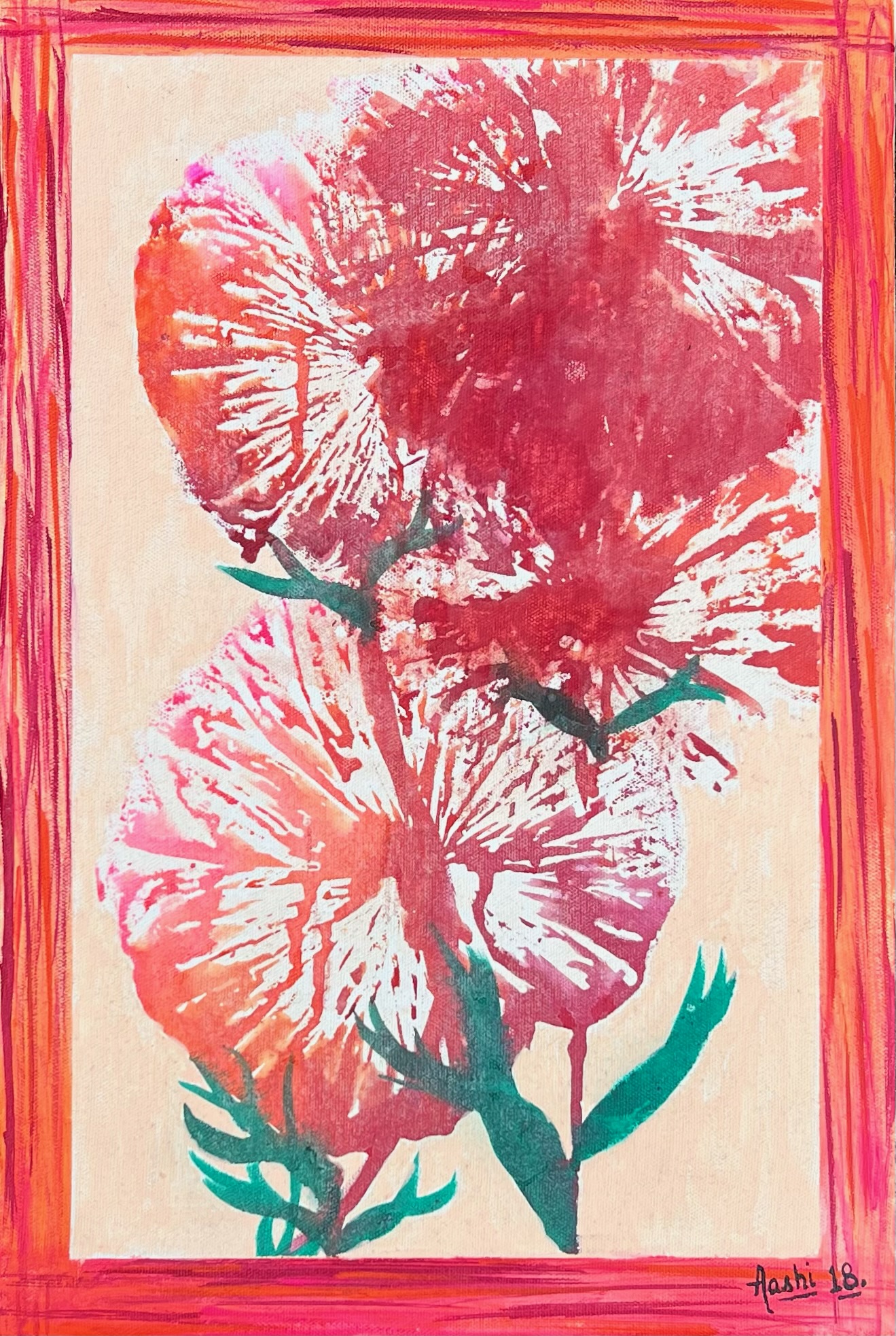
Bold floral forms appear pressed in time, like memories preserved.
Fossil reflects moments, emotions, or relationships that no longer move, yet still exist within us. It is about what remains: love, pain, beauty, long after the moment has passed.
Dream
This work feels soft and unreal, like thoughts drifting between sleep and waking. Colours melt into one another without boundaries, reflecting how dreams are never sharp or logical.
Dream speaks of imagination, hope, and the quiet place where ideas are born before they take shape.
Untitled Pride
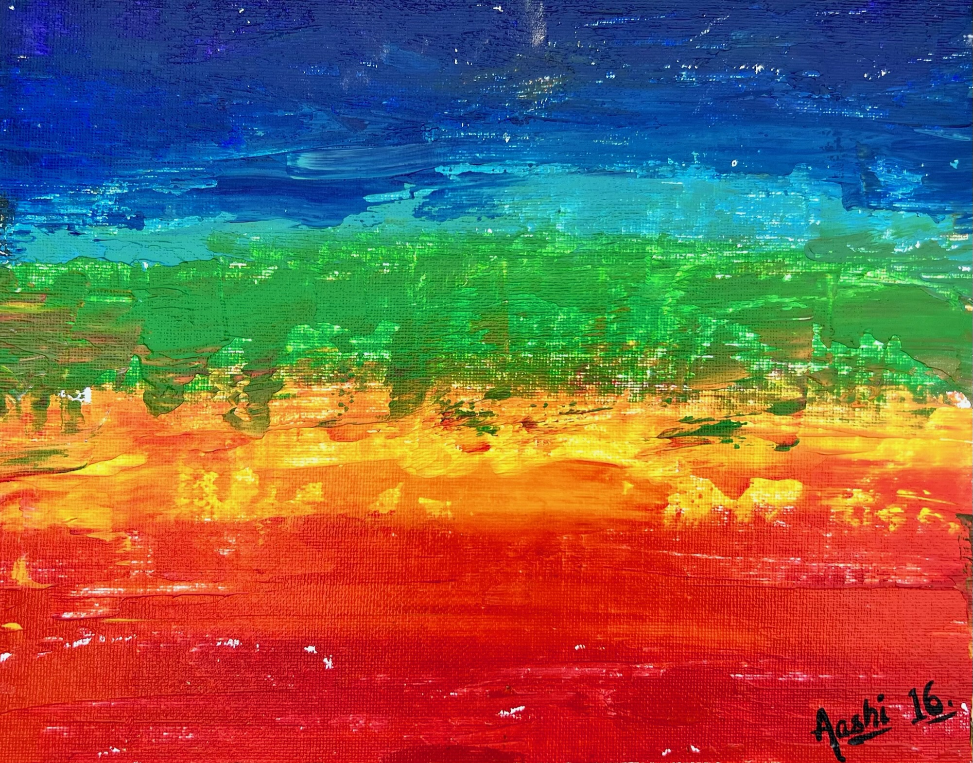
Untitled Pride feels calm, confident, and grounded. The colours rest in clear horizontal layers, each holding its space without competing with the other.
Red at the base feels strong and rooted, like standing firmly in one’s truth. As the layers rise, the colours soften and cool (orange, yellow, green, blue), creating a quiet upward flow rather than a loud declaration.
The spectrum echoes the LGBTQ+ pride flag, offering support through presence rather than proclamation. Pride here is not performative. It is steady, dignified, and deeply personal: about self-acceptance, identity, and the courage to exist authentically.
The work holds space for diversity and belonging, reminding the viewer that pride does not always need to shout; sometimes it simply stands, unafraid and whole.
Pink Love
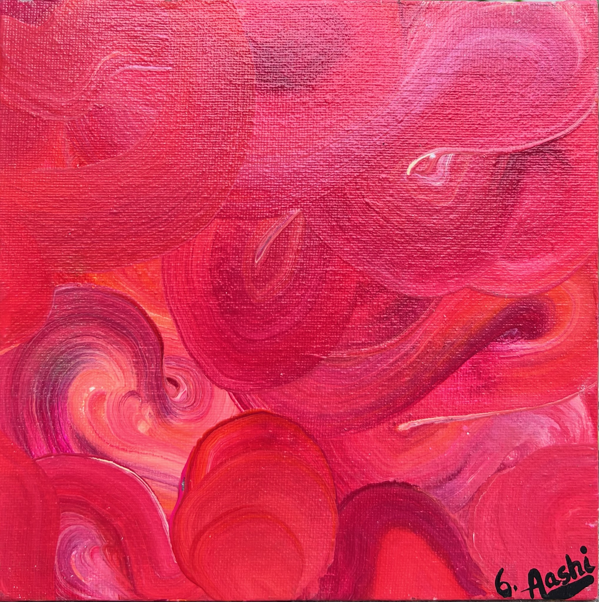
This work feels warm, tender, and emotionally open. The layers of pink and red flow into one another without sharp edges, creating a sense of softness and vulnerability.
The movement is gentle, like feelings that are strong yet caring. Pink Love speaks of affection that is not loud or demanding, but deep, nurturing, and sincere: love that holds rather than overwhelms.
Together with Serenity and Pride Charm, Pink Love forms a balanced trio (love, calm, and dignity), each holding its own emotion while existing in gentle conversation with the others.
Serenity
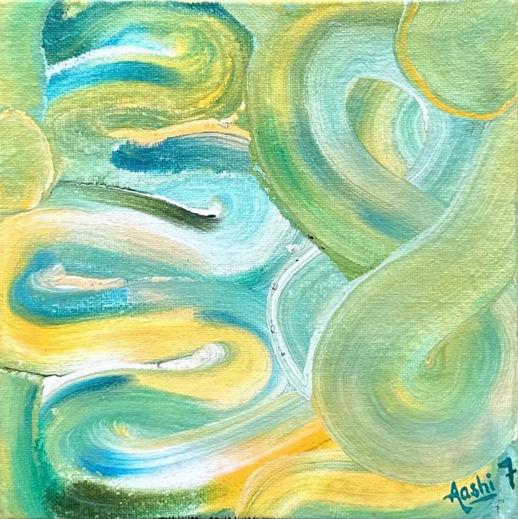
This piece feels calm and breathable. The greens, blues, and soft yellows move smoothly across the surface, creating a quiet rhythm that soothes the eye. There is no tension here, only flow.
Serenity reflects a state of inner ease, where the mind is clear, emotions are settled, and one feels in harmony with themselves and their surroundings.
Together with Pride Charm, these works form a balanced trio (love, calm, and dignity), each holding its own emotion while existing in gentle conversation with the others.
Aashi’s Mind During Exams
Aashi’s Mind During Exams captures the mental turbulence many experience but struggle to express.
The surface is dense with swirling strokes, layered textures, and restless movement, reflecting thoughts colliding, looping, and overlapping under pressure. There is energy everywhere, yet no clear pause, mirroring the state of a mind filled with deadlines, expectations, fear, and focus all at once.
Originally created by Dr Aashi Verma for one of her students, the work received its name when the artist’s thesis guide remarked, “This looks like Aashi’s mind during exams,” likening the restless canvas to the artist’s own state of mind. The title stayed because it resonated instantly.
Today, the work stands as a visual language for exam anxiety, making visible what countless students feel but cannot put into words.
Pride Charm
Pride Charm holds a quiet, grounded sense of dignity, a steady pride that rests in presence rather than proclamation.
Together with Pink Love and Serenity, Pride Charm forms a balanced trio (love, calm, and dignity), each holding its own emotion while existing in gentle conversation with the others.
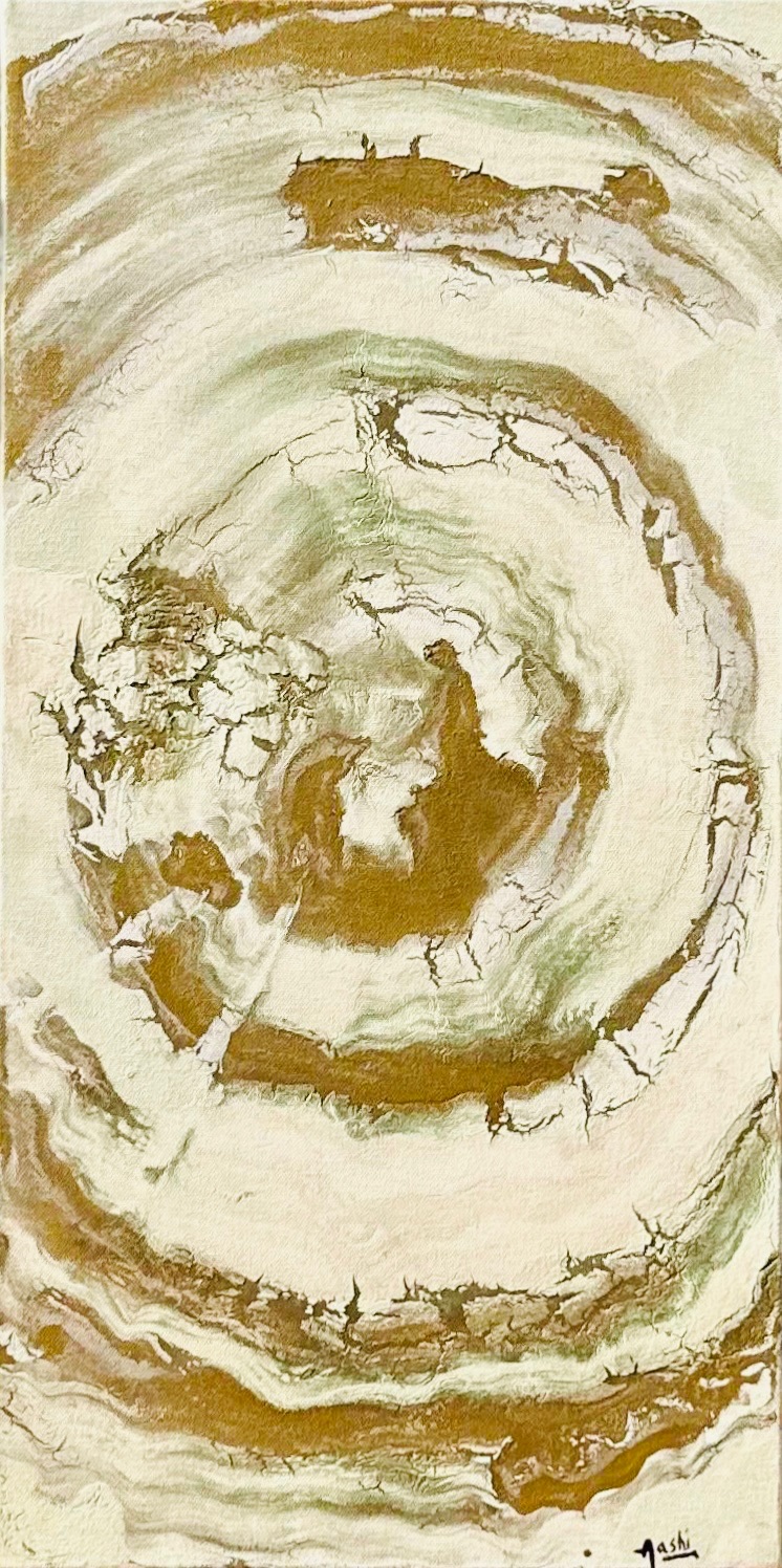
Peace
Peace was created after the storms of life had passed for the artist and healing had begun. It represents a state of calm that arrives slowly, with time, rather than all at once.
The palette is intentionally soft and restrained. White dominates the surface, creating a sense of stillness and space, while gold is used to convey honour, divinity, and quiet dignity. Together, they reflect a moment of balance, where life feels gentle again.
At the heart of the work, forms appeared without intention. Some see a wolf and a man, others a dolphin and a man. These shapes emerged naturally through the flow of paint, not by design. Because they were never planned, the meaning of the work remains open, inviting the viewer to find their own meaning. The spontaneously formed figures suggest that the meaning of peace is not the same for everyone: it can sometimes be found unexpectedly, in ways one does not plan or seek.
Within the Feelings series, Peace is a pause. A moment where the noise fades, emotions settle, and the heart finally rests.
Contemplation
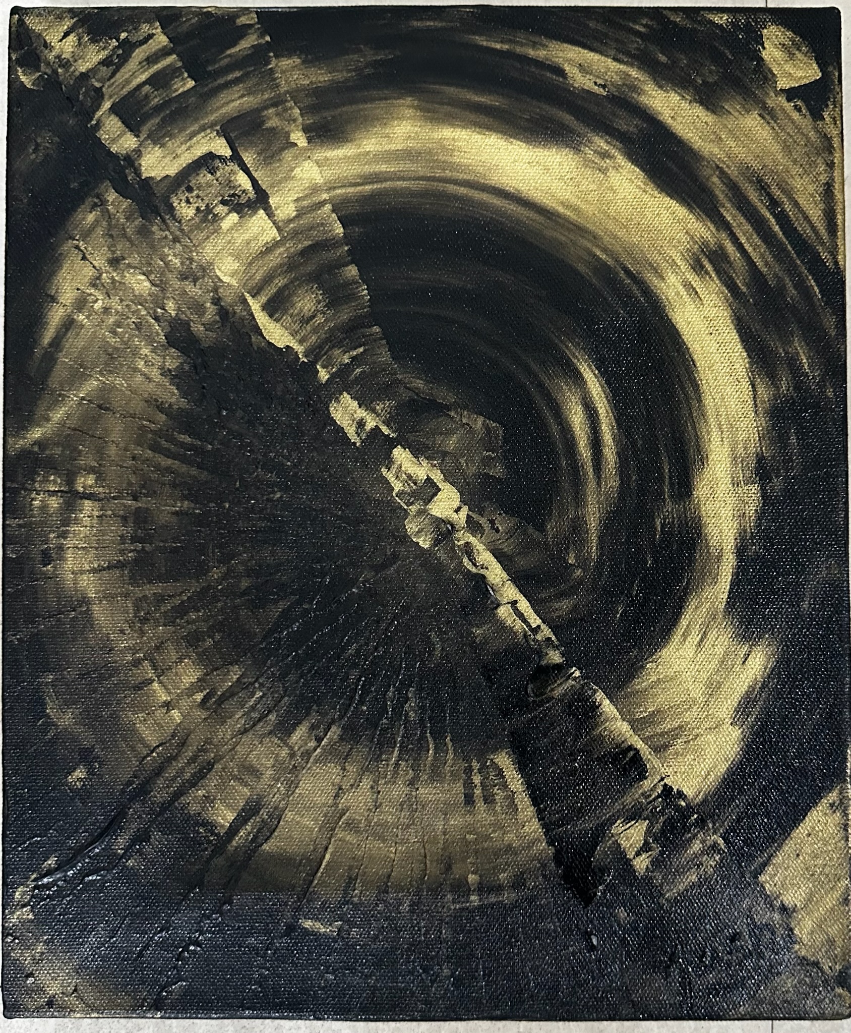
Contemplation reflects the two sides that live inside one mind. The black represents the darker, heavier thoughts: the doubts, fears, and negativity that quietly occupy space in the brain. The golden half stands for the higher side of the self, chivalrous, righteous, calm, and aware.
Placed together in a balanced, yin-yang form, neither side is denied and neither is dominant. The colours speak honestly, showing that contemplation is not about choosing one side, but about recognising both and allowing the higher, wiser part to exist alongside the darker one.
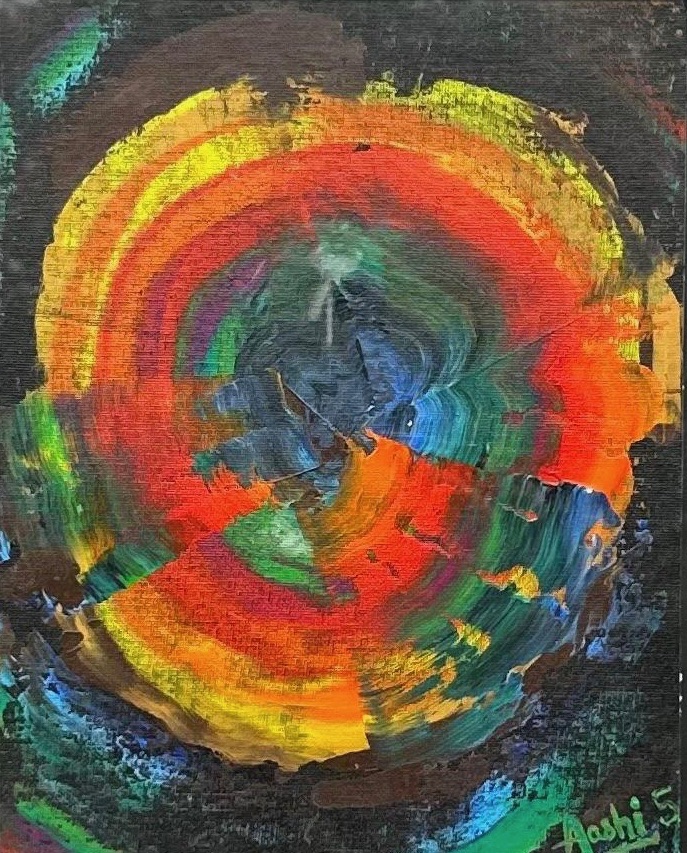
Focus
Focus is a choice between distraction and direction.
The bright pinks, reds, and oranges represent everything that pulls attention outward: noise, attraction, emotions, and everyday distractions. As the eye moves inward, green and purple begin to appear, acting as transition colours that guide the mind away from chaos and toward intention. These shades slowly lead into the dark centre, the tunnel of focus, where external noise fades.
At the heart of this tunnel sits red again, steady and balanced. It represents clarity regained, balance found, and energy brought back under control. Focus shows that true balance is not the absence of distraction, but the ability to move through it and arrive at stillness with purpose.
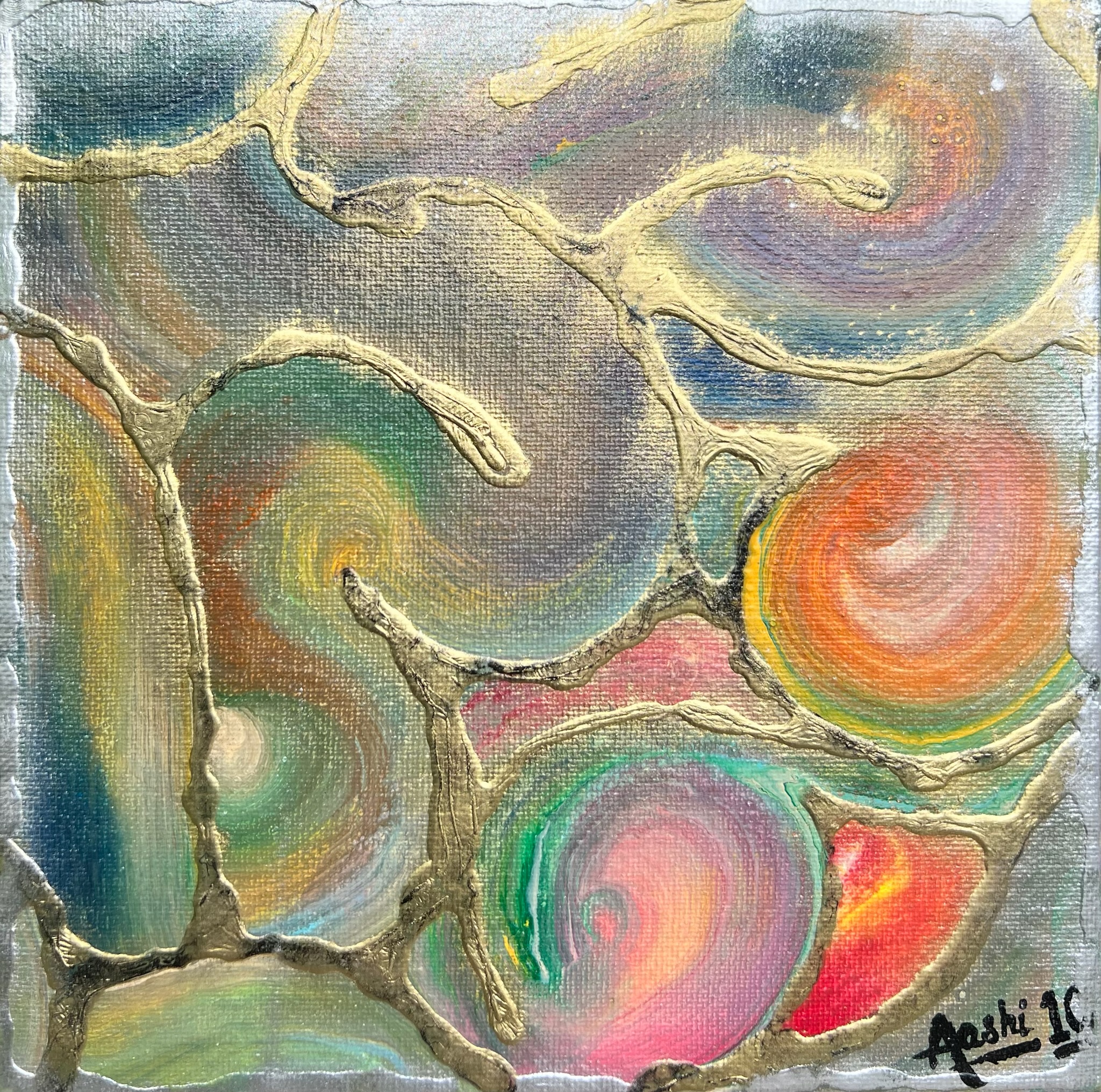
Hanging Dreams
Hanging Dreams shows dreams as delicate, multicoloured flowers suspended upside down, waiting quietly. They are not falling, and they are not fading. They are simply there, available. Some hang low, easy to reach. Others float higher, asking for more effort, more courage, more persistence.
Hung upward toward the sky, they resemble stars, carrying the feeling of night, because we often believe dreams belong to darkness, to sleep, to distant wishes. But the work gently challenges that idea. Dreams are not meant to stay hanging forever. The moment one chooses to reach out and pluck a dream, it stops being a dream and becomes reality.
Lost
Looking at Lost, it feels like standing inside one’s own head when everything is happening at once.
The circular movement pulls the eye inward, as if thoughts are spinning without a clear direction. Colours appear bright and alive, yet they don’t settle: they overlap, collide, and blur into each other. This gives the sense that nothing is missing on the outside, yet something feels unsettled within.
The dark background creates isolation, like being surrounded by noise but still feeling alone. The centre does not feel calm or stable; it feels confused, layered, and searching. It reflects a state where emotions exist, energy exists, colour exists, but clarity does not.
Lost does not feel empty. It feels crowded. Crowded with thoughts, feelings, possibilities, and questions, all circling without an anchor. It captures that very human moment of not knowing where one stands, even while being full of life.
Deep
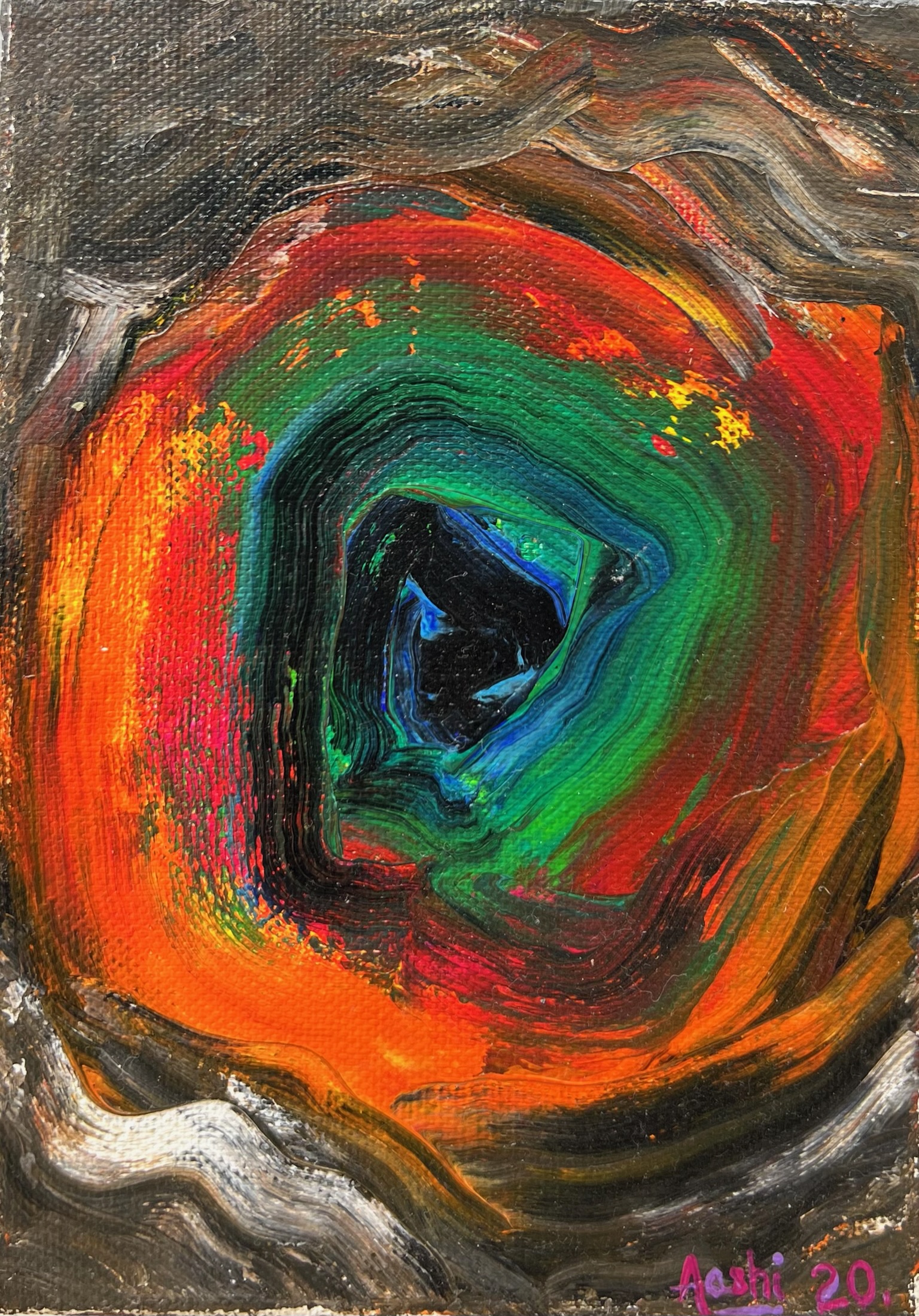
Deep feels like sinking inward, layer by layer.
The colours move toward a dark centre, pulling the eye in slowly, as if thoughts are travelling deeper into the mind. Bright oranges and reds sit on the outside (surface emotions, noise, everyday energy), while greens and blues begin to take over as the layers move inward. At the core, everything turns quiet and heavy, almost unknown.
There is no fear here, but there is intensity. It reflects the moment when one stops skimming the surface and begins to face what lies underneath, emotions that are not loud, but powerful. Deep captures that inward journey, where answers are not immediate, but truth exists beneath the layers.
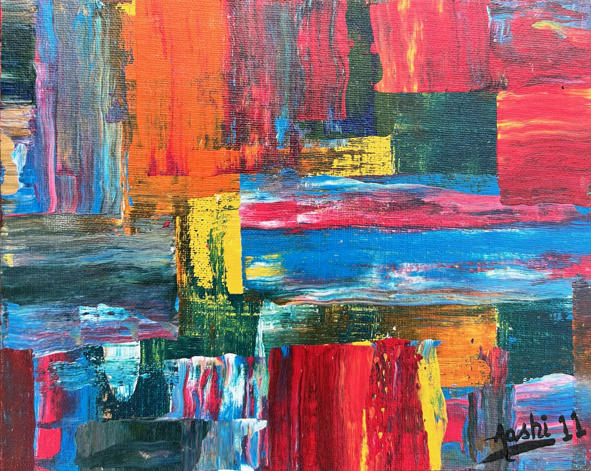
Feelings
This painting is layered, restless, and alive. Blocks of colour sit beside and over each other, much like emotions that exist together without order.
Feelings captures the chaos of the inner world, where joy, anger, confusion, and hope all occupy the same space.